Module 3A: Color Theory
The Color Wheel
A color wheel is a simple representation of primary and secondary and tertiary colors for any given color space. Not to be confused with the red, blue, and yellow color wheel you learned about in elementary school. Photographers mostly concern themselves with the color wheel for the RGB color space because these are the three additive colors of white light.
The RGB Color Wheel
On the RGB color wheel, Red, Green and Blue are the primary colors. These colors are represented by the numerical value in an RGB color space as follows:

R G B
Red: 255 0 0
Green: 0 255 0
Blue: 0 0 255
Secondary Colors
In an RGB color space, the secondary colors are Cyan, Magenta, and Yellow. These colors are created when equal amounts of the neighboring colors are blended.

Tertiary color
Tertiary colors are created by mixing either: one primary color with one secondary color, or one primary color with two secondary colors.

Additive Light
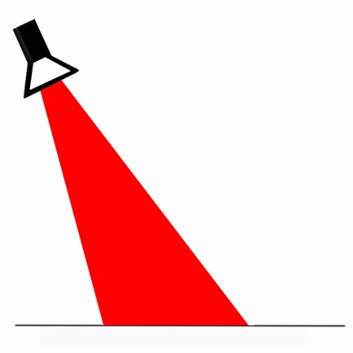
Theatrical lighting is a great place to look at how additive light works. If a stage is lit with a red spotlight, everything will appear to have a red hue
If you add a second spotlight that is green, then the two lights combine to produce a yellow light where the two occupy the same area.

Something very interesting happens when we add a third spotlight to the mix. The three spotlights create white light!

Notice how the area that is occupied by all three colors equally is white. The eye perceives elements illuminated in this area as having natural color like it would in daylight (5500°) conditions.
In the area where only two lights overlap, we see the same secondary colors that we saw on the color wheel. Remember these secondary colors are produced when the two colors are blended in equal parts.
Subtractive Color
We have seen the additive colors of red, green, and blue in an RGB color space. These additive colors are a part of photography in the fact that you deal with light, and the color of light, in a reflective environment. Corrections are made to color at the time we capture an image by adjusting white balance. You will also deal with RGB when calibrating your monitor which is made of pixels that emanate RGB color values.
When printing images it is important to ensure your images are color balanced appropriately. Photographic processes that involve applying inks to paper do not achieve color by mixing light; they achieve color through mixing pigments or dyes.
The secondary colors we saw in the RGB color wheel are cyan, magenta, and yellow. These are the three subtractive colors used to create the primary colors of pigments used in the printing process.
Imagine that the first image below is an illuminated softbox and we are looking at the front of it.

If a cyan filter or gel is placed in front of it, the filter absorbs a portion of the white light, and we clearly see the filter as cyan.

If we add a yellow filter and allow it to overlap with the cyan filter, the two combine to absorb wavelengths leaving us to see green.

If we add a magenta filter and allow it to overlap the other two, we see the filters absorb a variety of wavelengths producing these results:

· Combining yellow and magenta makes red.
· Combining magenta and cyan makes blue.
· Combining cyan, magenta, and yellow creates black.
When adjusting the color for printing or output, focus on subtractive color. For example, to adjust an image that is too blue, reduce the amount of blue by adding yellow. Yellow absorbs blue.
Facets of Color
There are many facets of color from saturation to color temperature. But in the context of composition, let’s look at color to determine the best way to represent the subject and the desired effect of color on the subject.
It has been shown that color affects mood and emotions. In the next section, we are going to look at other general facets of color and how they relate to the subject matter.
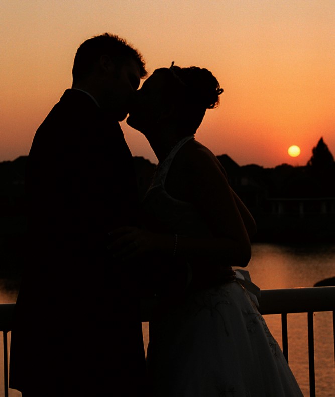
Warm Colors vs Cool
Warm colors are the hues from red through yellow, browns, and tans. Warm colors are said to be active because they tend to increase the viewer’s attention and stimulate the senses.
Cool colors are considered to be the hues from blue green through blue violet, as well as grays. Cool colors tend to be more passive because they tend to have a calming and relaxing effect on the viewer.
Warm colors are said to advance while cool colors tend to recede.
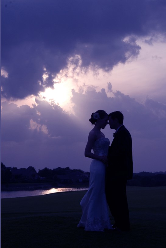
Dark vs Light
Dark colors can be any hue that is mixed heavily with black. Blacks, browns, dark blue, dark green, etc., describe these color values. These colors tend to have a comforting effect on viewers. These color values may be described as low key.
Colors with little to no color values, such as white, are considered light colors. These colors create more stimulus for the viewer compared to dark colors and are also called High Key.
Photographers will use color to emphasize emotions and to add a visual cue to the feeling and the mood of the setting or the subject. There is also much symbolism that comes from color selections.
Simple visual cues for hot come from the use of the color red, where cold is often represented by the color blue.
The warm colors were boosted to prepare this desert scene for printing. It adds to the feeling of being in a hot desert.
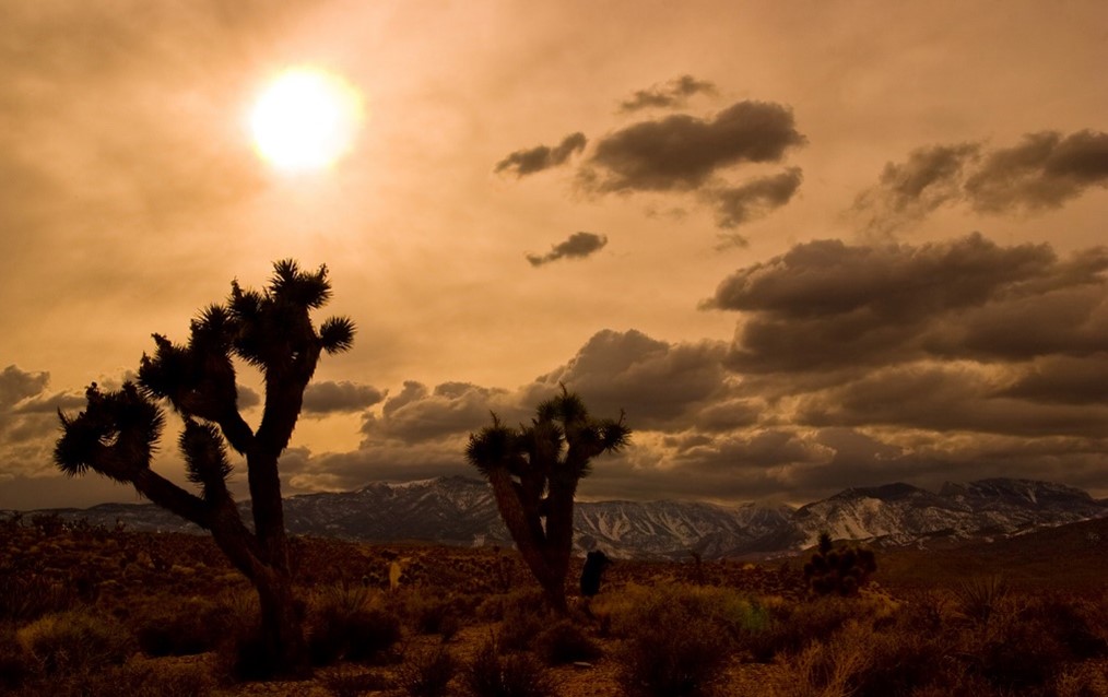
This image was actually taken in very early March and there were places with snow on the ground. The image feels very different when we boost the cool colors.

The day was very hazy, and the colors were very bland. Knowing the effect of color on mood gives us a couple of options for preparing this otherwise, drab image.

Tonal Values and Hues
Hues are made up of the twelve colors named on the color wheel. In a reflective light environment (RGB), they include the three primary colors (red, green, blue), the three secondary colors (cyan, magenta, yellow) and the six tertiary colors (orange, chartreuse, spring green, azure, violet, rose).
Tints are created by adding white to any hue on the color wheel.
Shades are created by adding black to any hue on the color wheel.
Tones are created by adding both black and white to any hue on the color wheel.
Color Harmony
Harmony in any form represents a pleasing blend of values to create an enjoyable environment. From a visual standpoint, color harmony might be defined as the pleasing arrangement of color utilized throughout an image. This will include a pleasant blend of colors that appear in the foreground, middle ground, background, subject matter, subject clothing and props.
From a planning or execution standpoint, the photographer will select background and accent colors based on the subject and the clothing selections of the subject. However, the reverse may also be true in that often a location is selected, and the photographer will select the appropriate clothing for the subjects to wear in that environment. The key is good communication and planning. Rarely would all of these elements come together on their own without a bit of preparation on the part of the photographer and the subject.
“Seeing” in a Reflective Light Environment
The degree to which we see color and record color is vastly different. Our eyes work with our brains to do some degree of mental color correction. This is why we see a sheet of paper as white even when viewed under a tungsten light source. If we take a photograph of that sheet of paper with your camera set to daylight and that white sheet of paper is definitely yellow or orange and there is nothing your brain can do to tell you it is otherwise.
Photographers must learn to see the abstract realm of the color of reflected light and recognize its impact on the color that will be recorded, and more importantly, how to correct it.
It is also good for photographers to see the abstract realm of color as it pertains to selecting colors to be included in an image and those colors that should be excluded from an image.
Tonal Values
Key: Refers to the overall colors or tones of an image.
High Key: Refers to an image that is created using mostly light tones and bright backgrounds.
Low Key: Refers to an image that is created using mostly dark tones and dark backgrounds.
High Key Image Low Key Image
Contrast
In composition, the term contrast can be used to describe a number of things. Contrast is defined as the illustration of the differences that exist between two or more elements. It addresses the very distinctive and opposite features between them. The usual pairings include good and evil, hard and soft, and black and white. With these three examples, we have one pairing that represents ideals, (good and evil), one that represents the physical, (hard and soft) and one that represents the visual, (black and white).
With photographic compositions, the photographer will often include various contrast representations in telling the visual story.
Contrast in ideals, as seen in the image below, is a universal theme: Beauty and The Beast, Sweet and Sultry, Life and Death. Whatever your theme may be, contrasts are a great way to tell your story.
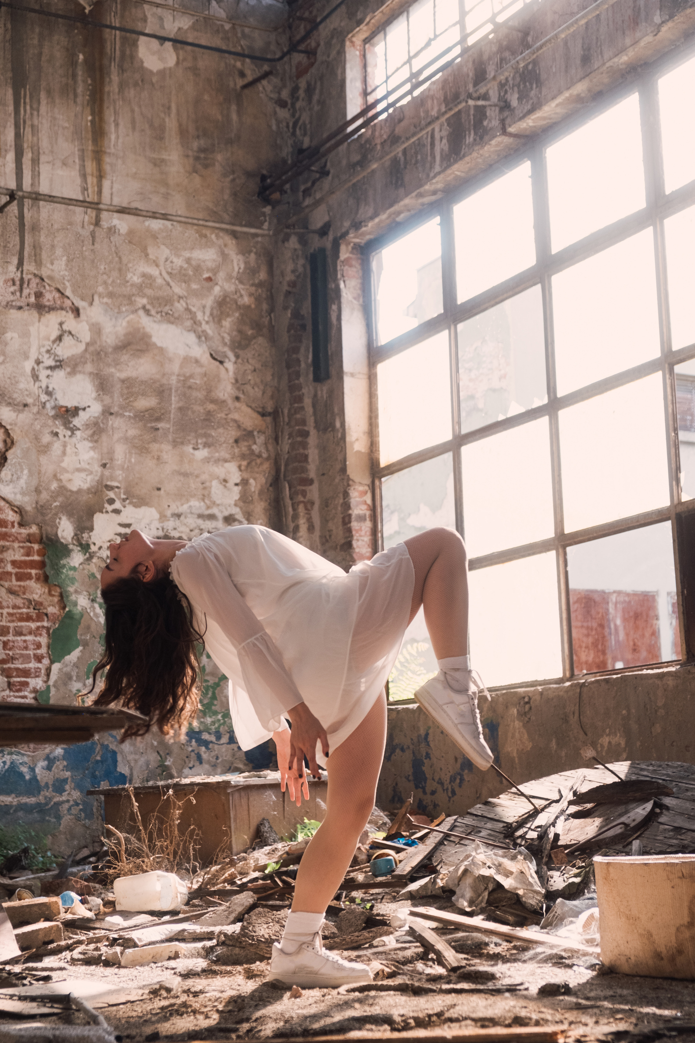
Photographers may use physical contrasts in a photographic composition to help set the subject apart and provide strong subject emphasis. Contrasting textures is a great way to make a statement. This is why photographers may elect to photograph a model against a very rough textured exterior. The contrast of the rough texture of the background will contrast the smooth texture of the model’s skin which will set the model apart.

The image of the bride above contrasts the darker tonal values of the background with the bright white of her dress. It also contrasts the sense of beauty of the model with the utilitarian simplicity of this alley. The disconnect between the bride and the background bring attention to the model.
Then, there are those visual contrasts that deal with color and tonal values. A model in a black dress will easily stand out against the stark white of a high key background.

In this image below, you can see the warm tones of the lights on the skyscrapers in contrast with the dusky blue sky.

The goal is to use these contrasts to tell your visual story and to make sure that contrasts don’t serve as a distraction or a nuisance in creating your composition.
Saturation of Color
The saturation of color is the relative brightness of the color. From a compositional standpoint, backgrounds with subdued color saturation may be perfect for presenting a subject wearing highly saturated fabrics because the subject will stand out.
Conversely, a subject could be overwhelmed by backgrounds and colors that are highly saturated because they tend to be busy and attract attention away from the subject.

Saturation of Color
Color saturation is relative to the amount of light reflecting from a given color in relation to the subject and the overall exposure. There may be occasions to work in a location where a highly saturated background can be subdued by blocking light reaching the background or by raising the illumination of the subject relative to the background (fill flash, for example).
There may also be situations where a photographer will add light to a scene to bring out the color saturation of a specific area or even use gel filters on supplemental lighting to increase the color saturation of a scene.

Effect of Patterns
Patterns in a composition can work for or against the photographer. Patterns in a scene can create visual interest and movement creating an opportunity to place a subject into the scene at precise points to take advantage of the leading lines or repetitive patterns.
One great technique is to create a composition that contrasts with the patterns. The strong, vertical patterns created by the doorway are a wonderful contrast to the diagonal composition of the bride.