Module 3D: Angle of View
D. Angle of View
Perspective
We discussed convergence as it relates to tall buildings, but these same distortions occur when photographing people. Sometimes we use these distortion effects intentionally to help convey the overall feeling of an image.
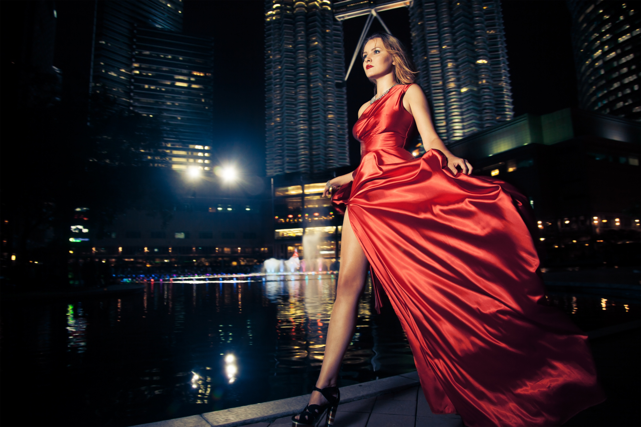
For example, a lower camera angle will cause a person to look taller. This can be done deliberately to enhance the stature of a subject, perhaps demonstrating power or authority.
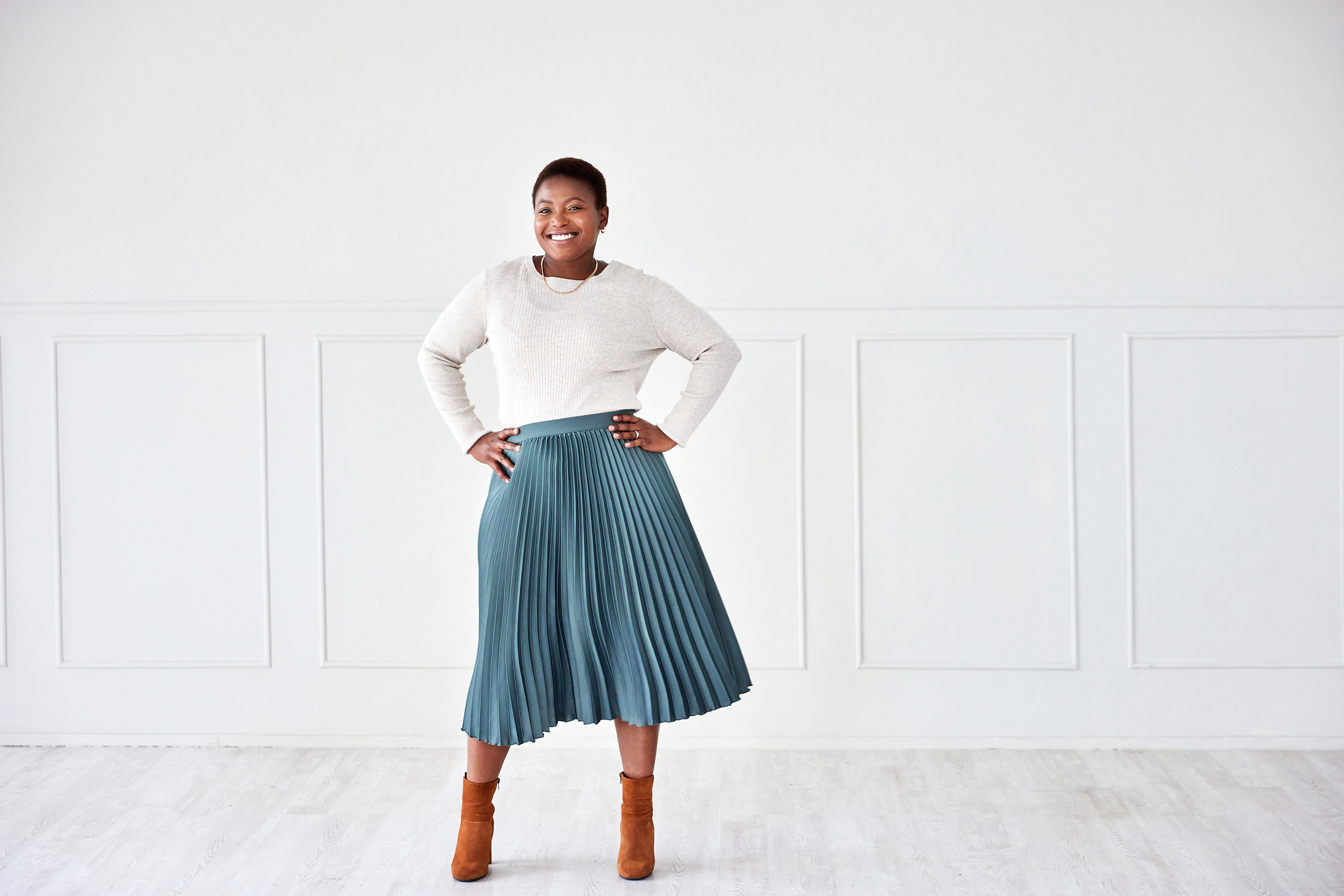
Higher camera angles tend to somewhat foreshorten a subject. This may give the impression of dominance over a subject. High camera angles with images of children have something of an innocent feel to them.
Higher camera angles can be useful when photographing heavier subjects. Because items which are closer to the lens appear larger, a photographer may choose a pose where the face is somewhat leaned into the camera. Moving the face closer to the lens with the body being a bit further back may help flatter a subject.
For full length portraits, placing the camera at the subject’s waist level or slightly above will usually record the subject without noticeable distortion. For head and shoulders portraits, the camera placement would be at about the chest area or slightly above.
Rule of Thirds
This rule gives us a suggestion for the placement of the center of interest. Mentally divide the viewfinder into thirds like a tic-tac-toe board, creating nine equal sections. Then place the center of interest on one of the two horizontal or vertical lines.
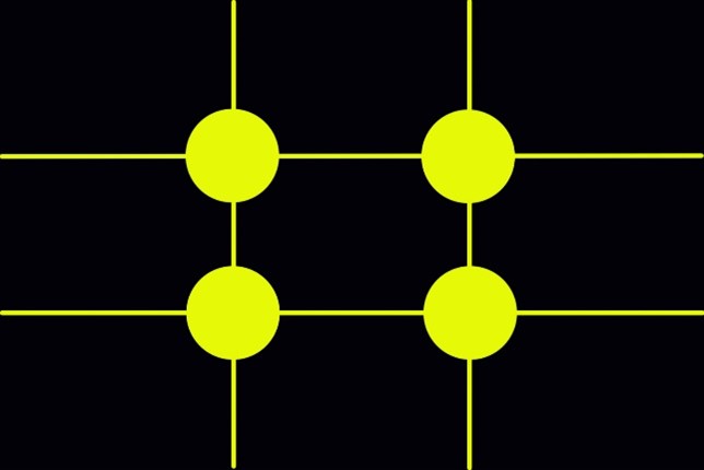
The intersecting points are also strong positions to use for placement of the center of interest or other elements. One thing to know about this rule is that it is okay to break it. Very rarely should the subject be placed right in the middle of the image unless you feel it will help to create a strong composition.
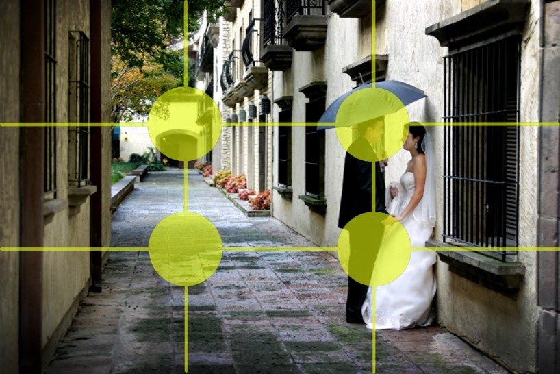
The placement of the bride and groom's heads in the upper right intersection give the above image a strong visual composition of the bride and groom.
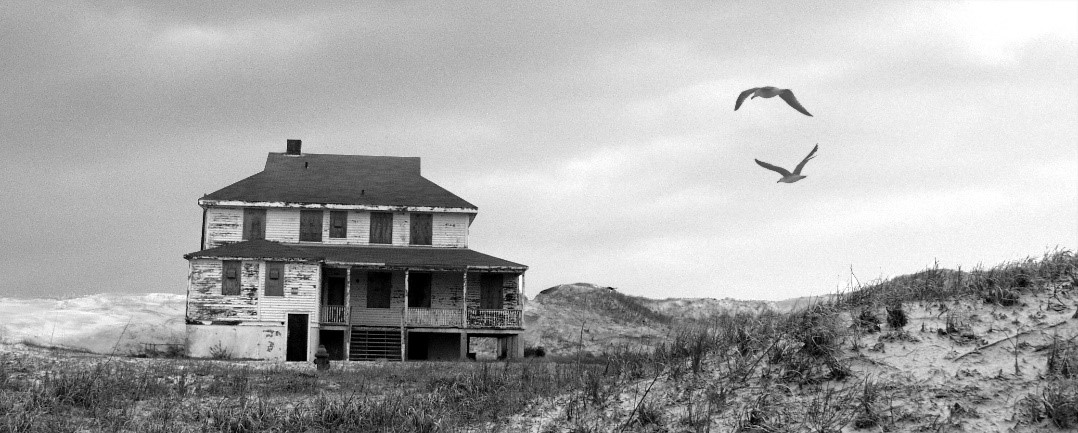
This image below uses the rule of thirds for the placement of the house and the birds.
Leading Lines
When it comes to arranging elements in a photograph, remember diagonal lines are dynamic. The eye enters an image from the left, assuming you also read from left to right, and travels a visual path through the composition.
Diagonal leading lines create movement and are a great way to direct the viewer’s eye to the subject.
The diagonal lines created by the windowsills and the baseboards all point to the subject and help to hold the viewer’s eye on the dancer.
Positive Space
Positive space is the area that is occupied by the subject. In posing the subject, we must make compositional decisions on how to best present that subject.
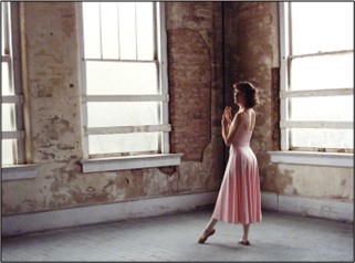
 In the image above, the model is the positive space. All the rest of the building interior makes up the negative space.
Negative Space
Negative space is all of the other space that surrounds the subject. In composition, we use the negative space to highlight the subject. It is as important to the visual success of the image as just about every other aspect of creating the image.
Negative space is a powerful tool to place emphasis on the subject and have the viewer notice the positive space.
Background color, background textures, tonal values, light values and balance of negative space with positive space are just a few of the considerations for selecting the negative space for a given subject.

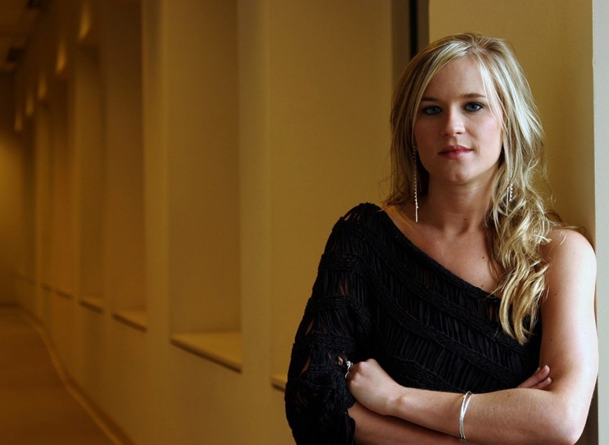
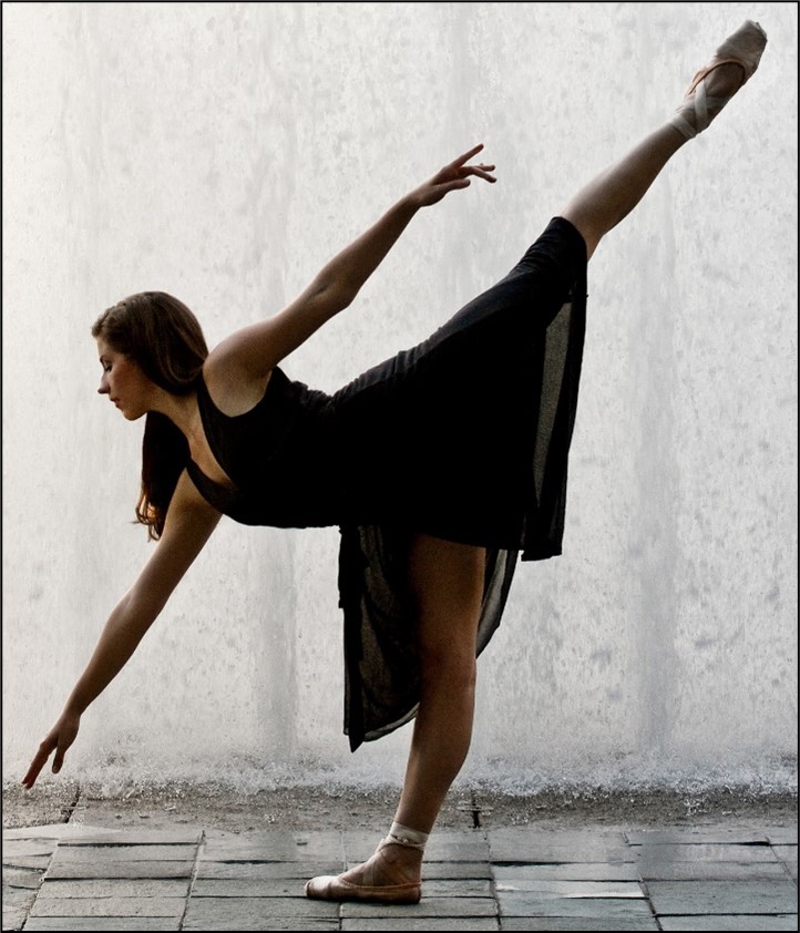
In this above image, a high key (light values) negative space was selected to make the subject stand out since it was in stark contrast to the low key (dark values) of her black shirt and her dark hair.
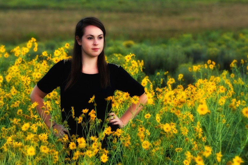
In the image below, a location of contrasting tonal and color values was used to set the subject apart. The uniform yellow and green hues in the negative space created a nice presentation to set off my model in her dark shirt and dark hair. The brightness of her face is also in harmony with the brightness of the flowers.
In the next image of the ballerina, there is a nice balance of the positive space with the negative space.
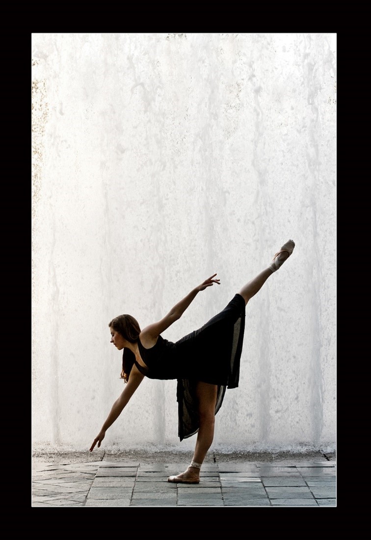
It also uses strong vertical lines in the negative space to set off the strong diagonal lines of this dance pose. The black mat around the image contains the entire image and helps to focus the attention on the dark tonal values of the dancer.
So how important is the relationship of the negative space to the positive space?
Improper use of negative space may leave the subject feeling very crowded with little room to breathe or for movement. In the image above, the tight crop leaves the feeling that the subject is confined and boxed in.